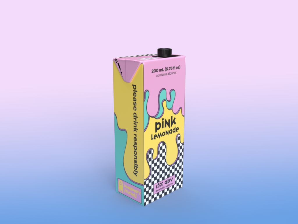
The colors for imaginary friends were chosen to be fun, inviting and tie into some Y2K vibes. The idea behind the company's name is a play on words that if you drink too much, you'll start to see/have imaginary friends (not a recommendation). The ghost icon in the logo represents that, but has a stylized feel to visually tie into the branding. The fonts were chosen to be fun and out-there with varying styles/weights. I chose the variex OT font because of its messy style, and that seemed fitting considering the beverage's name.
