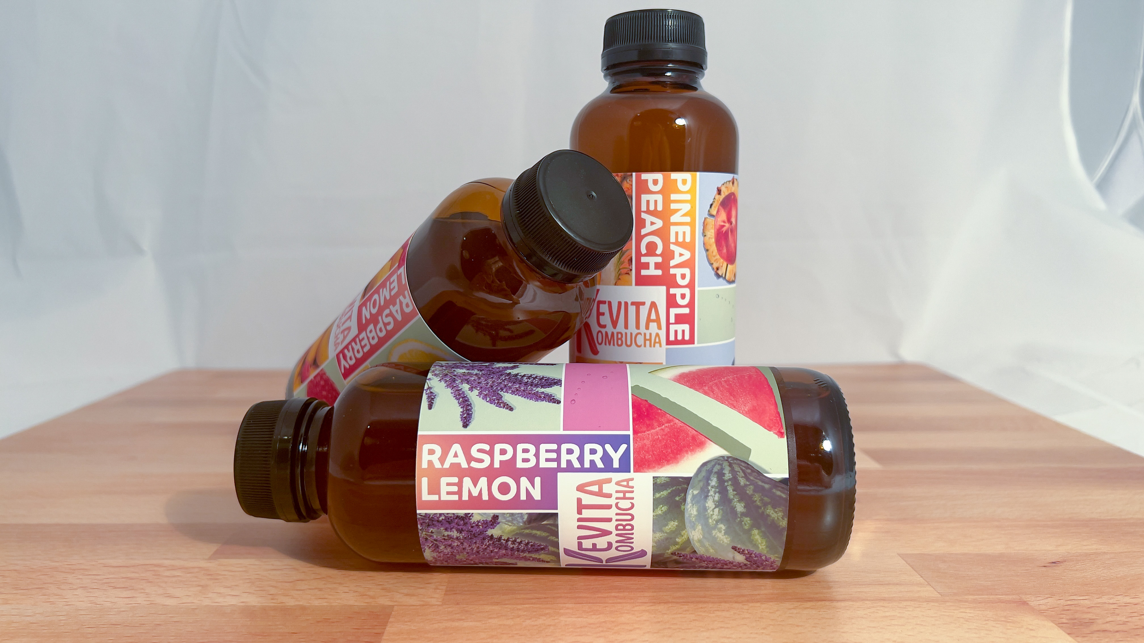
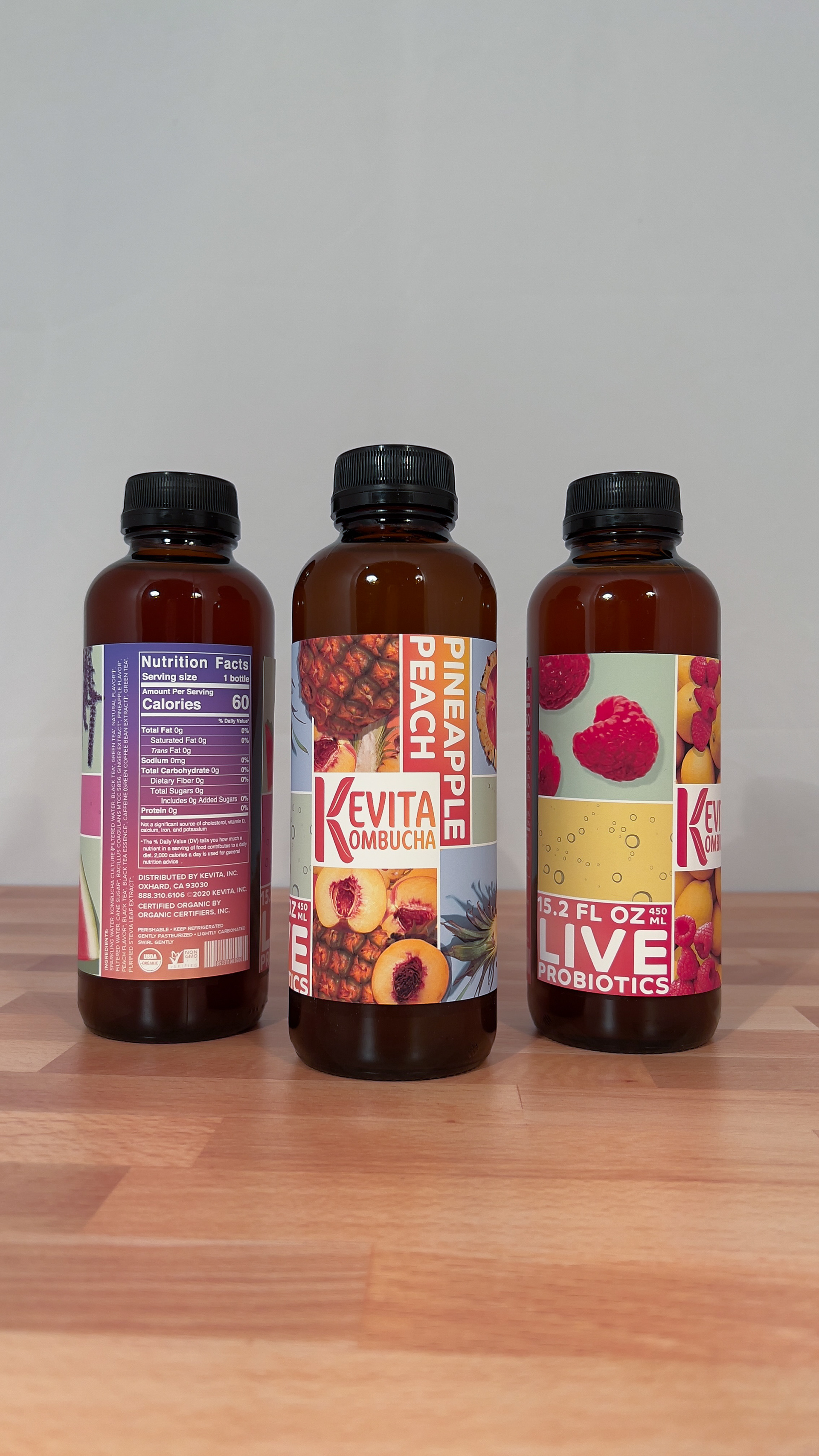
The original KeVita logo was created by the company's marketing team to maintain equity, centering around the "V." However, this logo didn't capture the true essence of the KeVita brand. I chose to focus on the K as it represents the name itself, KeVita Kombucha, and shows the active and health-oriented image of the company.
During my research I found that KeVita positions their product as accessible to everyone looking to better themselves physically through their gut-health. They base their products on a consumer's healthy, active lifestyle choices and the new packaging design reflects that.

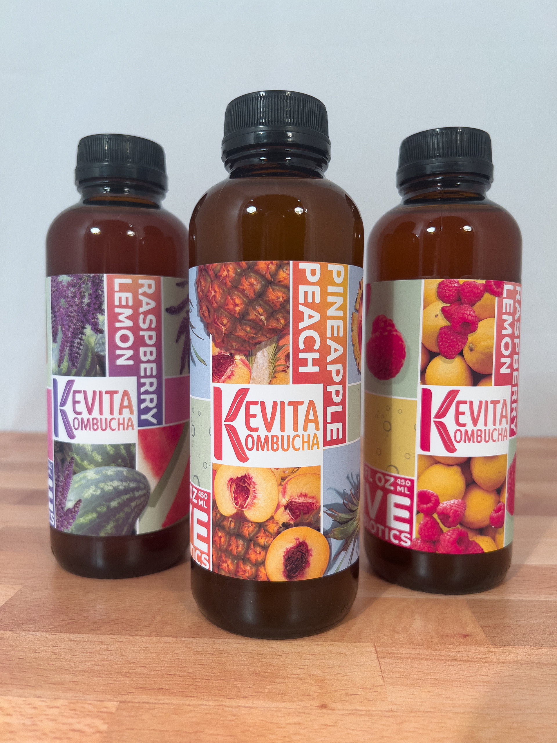
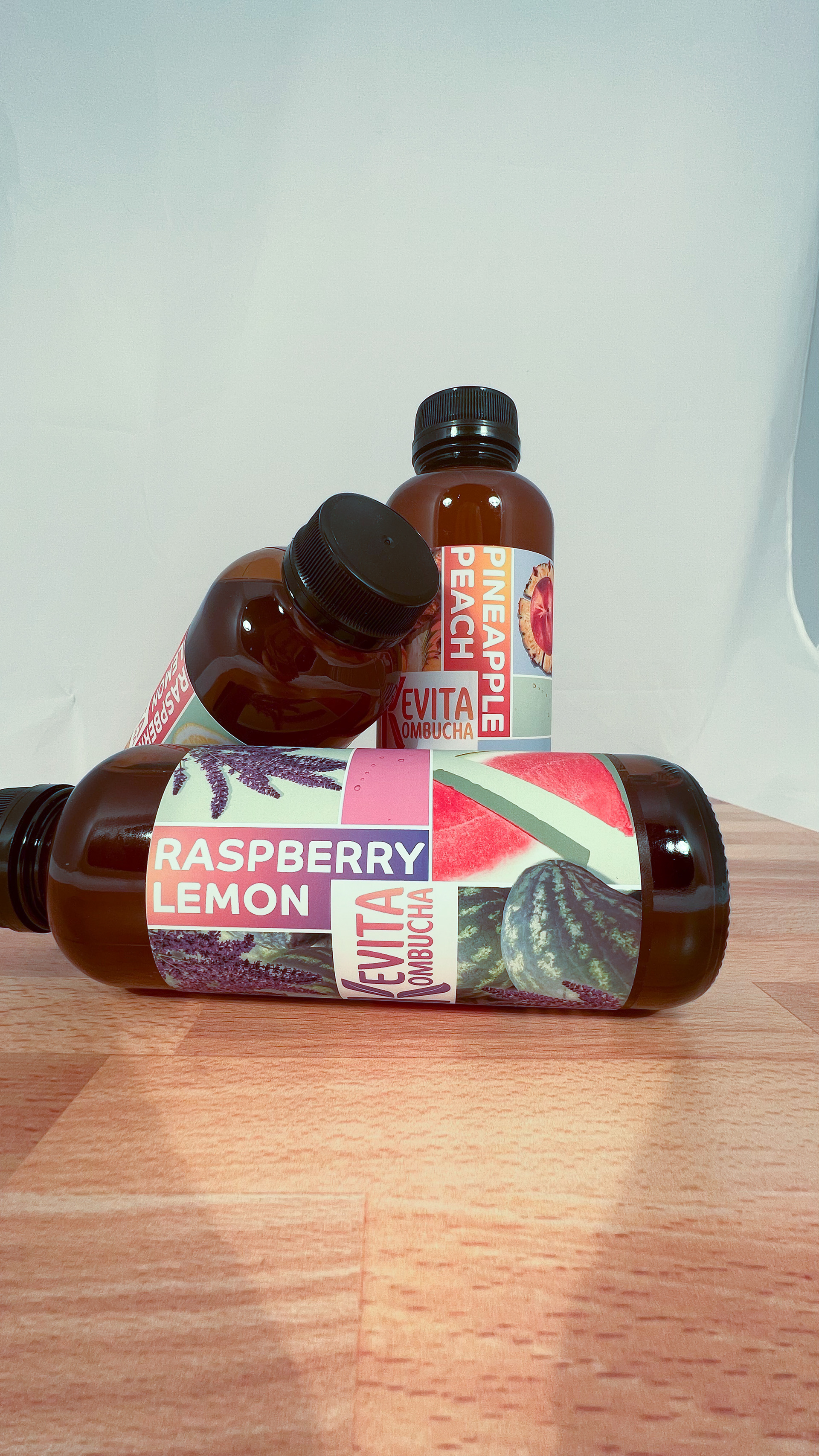

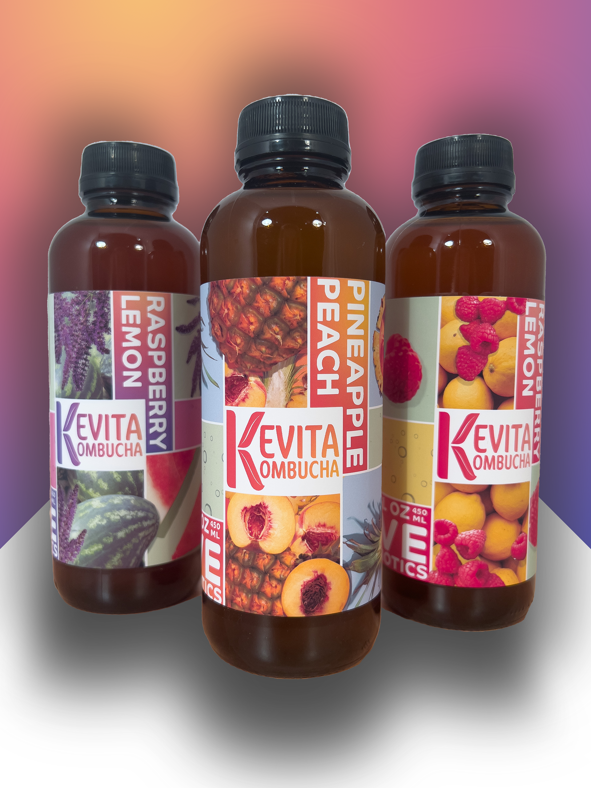
Product Images & Flat Designs


